Since I attended LibreGraphics 2013 conference in Madrid the idea of open source design has been going around in my head. A Kaleidos designer (or a front-end developer) uses open source software in his day-to-day work but sadly, most of it lacks basic usability and design features. This ΠWEEK was slightly different for some of us: after some years using Inkscape as our main design software we decided we should contribute to the community with what we know how to do best: our passion for design (yes, no code involved here, sorry).
We believe that Inkscape is a powerful tool. Born in 2003 and developed actively since then, it probably never had an actual UX and design work behind. Most current Inkscape developers recognize that Inkscape UI could use some serious work. Most of its features have been added piece-meal over the years without much thought about consistency.
Our goal
We’ve made several working sessions to clarify the main inkscape problems in terms of user experience. We got to a list of good and bad things that led us to what we found were the major issues that we will act upon:
- There are a lot of non-key features at plain sight and at the same level of some fundamental ones.
- There is no consistency in the user flow.
- There is room for improvement on visual design.

A big of insight
While we agree that Inkscape is powerful and flexible, we found out that most of the designers still using proprietary software (paying it or hacking it) because they think that Inkscape is not stable and professional enough for their current job. And surprisingly, most of them agreed that the lack of confidence in open source software as Inkscape was caused by its interface and poor usability.
Who is behind this project?
The team behind rethinkscape was a perfect combination of Inkscape potential users:
- Andy (@myfunnyandy{.ProfileHeaderCard-screennameLink.u-linkComplex.js-nav}): A brand new Kaleidos colleague. UX designer and renaissance man. He had little or no experience with Inkscape. At the end of the week he found out that three new gray strands of hair had grown on his head.
- Juan (@elhombretecla): Designer at Kaleidos and a renaissance man as well. This was his first year using Inkscape for design purposes in a professional position. He has a wide knowledge of proprietary design software and a lot of ideas but no one listened until now.
- Xavi (@xaviju) Me. Front-end developer at Kaleidos and Inkscape lover. Using Inkscape for some years made me start hiding in dark corners while eating fatty buns. This ΠWEEK I decided it was time to give something back to the community and save the lives of thousand of designers out there (specially mine).
How we did it are we doing it?
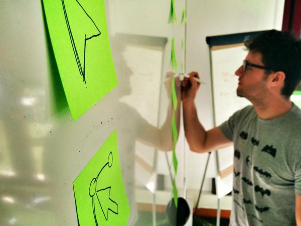
Before any pixel was drawn, we faced Inkscape UI in a whiteboard and a lot of post-its:
- Research: First of all we had a working session to determine the main problems, the main benefits and the main insights that led us to clarify the big picture.
- Analysis: With the investigation in mind, we decided that the main issues from a UX perspective that we have to approach are the structure, the tools and the visual design.
- Definition: We are already drawing wire-frames reflecting the conclusions we reached in our analysis and also making final design proposals.

Rethinkscape (current) results
With this in mind we decided to focus our Inkscape redesign proposal on three basic concepts:
Structure
We find the current layout structure a bit chaotic. Grouping the type of content and functionalities provided to the user will greatly facilitate his tasks. Defining areas can facilitate the user recognizing what he need without using his memory. We’ll discriminate between tools, subtools, panels and info. You can read more about recognition rather than recall
We defined different action areas so it could help not only at organizing the current content and features but also at providing a recognizable pattern for the user. This pattern should also facilitate the developers the decision making about where to place new features.
- Work Space: This is the main area. It should be big enough for the designer and keep its space as big as possible.
- Tool Bar: This is where the tools are.
- Settings bar: This is where the settings are.
- Color Palettes: This is where there the color palettes are.
- Info Bar: This is where the information bar is.
- Panels Zone: This is where the dockers panels are.
Tools organization and hierarchy
We find several usability issues on current tools placements and organization. There are too many options at plain sight, with a questionable or difficult to understand organization and with no apparent hierarchy.
Our proposal implies grouping similar tools, organizing them with some kind of hierarchy and displaying options and parameters consistently.
- Toolbar: Here we group the tools that will be used in most case scenarios. We create 3 subgroups: Shapes, Draw lines and Fill areas. Each group contains tools which affect our work in a similar way.
- Panels: This group is for windows with configurable settings, what we identified as the second level on the user’s needs.
- Document settings: The special one. Important but with low frequency of use, that’s why it’s separated from the rest.
Visual Simplicity
Visual design can make the difference if we want Inkscape to be used by all kind of designers (Visual, UX, Graphic, Interaction…) and non professional users. A modern, simple and visually beautiful interface will improve user experience.


What’s next?
This is not just an experimental idea or a funny ΠWEEK game. We actually got in touch with the real Inkscape developer and started an agile conversation to make this real. Some of them are giving us some feedback and we started to iterate. We will continue to work on it.
Inkscape is primarily created by volunteers and other people who are passionate… share your passion with us. Whatever way your team goes, we’re excited to see what you come up with. 🙂 We’re also happy to have you as users and in our development community!
Josh Andler, Inkscape developer
Glad to hear you love Inkscape! We would love to have you collaborate with us.
I think most current Inkscape developers recognize that our UI could use some serious work. Most of it has been added piece-meal over the years with out much thought about consistency.
Tavmjong Bah. SVG W3C Group Inkscape representative
Many of your ideas could be proper tools, while others should be re-thought when it comes to the panels and how they are activated and hidden.
Check out the whole project (still in progress) on: http://piweek.github.io/rethinkscape/


